Chapter 4 Plotting with R
4.1 Basic plots
R is not just an environment for the implementation and use of functions for statistical calculation but it is also a powerful environment for generating and displaying plots. Creating plots is besides an effective and quick way to visualize our data. By doing so we can verify whether data was correctly imported or not. However, creating graphics is also done by command-line instructions, which can sometimes be a bit tricky, especially at the beginning.
In R we can create many types of plots. With some packages it is also possible to generate maps similar to those created by GIS, although for the moment we will only see some basic types such as:
- Dot charts
- Line charts
- Barplots
- Histograms
- Scatterplots
Before going into detail with the specific types of graphics we will see some general concepts which apply to the majority of plots:
All graphics always require an object that contains the data to be drawn. This object is usually specified in the first argument of the function corresponding to each type of chart.
- There are a number of arguments to manipulate axis labels or the chart title:
main: text with the title of our plot.xlab: text for x axis label.ylab: text for y axis label.xlim: vector with upper and low range for the x-axis.ylim: vector with upper and low range for the y-axis.cex: number indicating the aspect ratio between plot elements and text. 1 by default.col: changes de color the plotted element. See http://www.stat.columbia.edu/~tzheng/files/Rcolor.pdflegend(): adds a legend element describing symbology.
4.1.1 Dot or point plots
This is one of the most basic types of graphics if not the most basic one we can create. To create such a graph we will use the plot() function. Let’s look at a simple example using data from fires.csv9:
par(mar=c(3.5, 3.5, 2, 1), mgp=c(2.4, 0.8, 0))
plot(fires$SPAIN)
As you can see, we are ploting data from the SPAIN column, ie, yearly fire occurrence data in Spain.
Remember RStudio displays plots in the right-bottom window. In addition, if you need to take closer look use the Zoom button to pop-up a new plot window.
Le’s tune up and enhace our plot. We can change the symbol type using the pch argument. You’ll find a list of symbol types (not just dot charts) at http://www.statmethods.net/advgraphs/parameters.html.
par(mar=c(3.5, 3.5, 2, 1), mgp=c(2.4, 0.8, 0))
plot(fires$SPAIN,pch=4)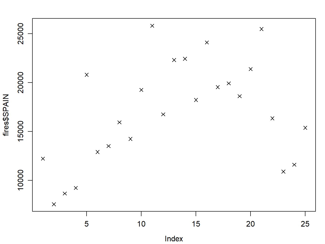
We can change symbol size using cex:
par(mar=c(3.5, 3.5, 2, 1), mgp=c(2.4, 0.8, 0))
plot(fires$SPAIN,pch=4,cex=2)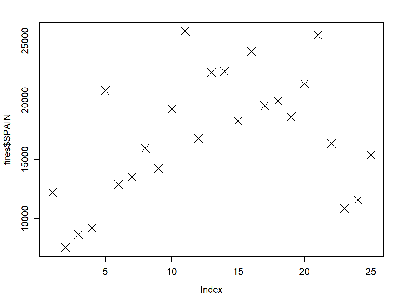
And we can change the color of the symbol with `col’:
par(mar=c(3.5, 3.5, 2, 1), mgp=c(2.4, 0.8, 0))
plot(fires$SPAIN,pch=4,cex=2,col='red')
The col argument can be specified either using the color name as in the example or using its code number, hexadecimal or RGB so that col = 1, col = "white", and col = "#FFFFFF" are equivalent. In some types of symbols we can also change the color of the symbol background in addition to the symbol itself using the argument bg:
par(mar=c(3.5, 3.5, 2, 1), mgp=c(2.4, 0.8, 0))
plot(fires$SPAIN,pch=21,cex=1,col='black',bg='red')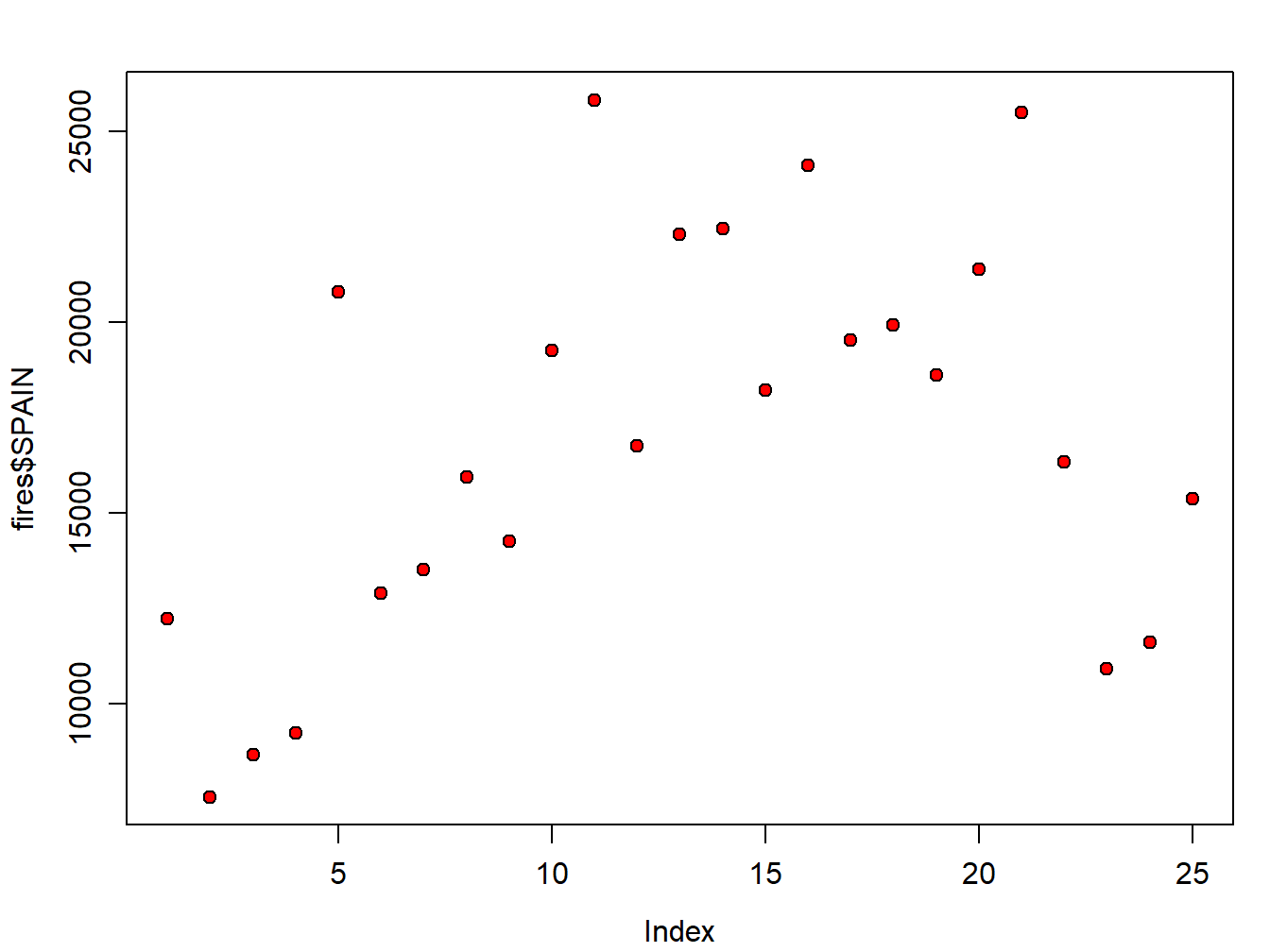
The finish our plot we will modify axis labels, add a title and a legend:
par(mar=c(3.5, 3.5, 2, 1), mgp=c(2.4, 0.8, 0))
plot(fires$SPAIN,pch=21,cex=1,col='black',bg='red',
main='Number of fires in Spain',ylab = 'Number of fires',xlab = '')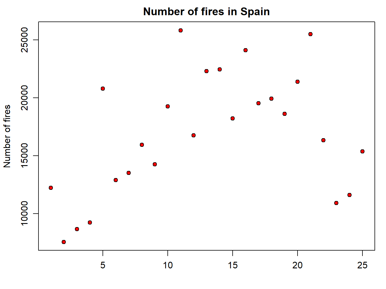 Note that we have used the
 xlab argument to leave the x-axis label blank. Now we add the legend. It is important you bear in mind that the legend is added with an additional command right after the plot statement. Legends in basic plots are just an image we add to an existing plot by emulating the symbol used in that plot using the legend() function:
par(mar=c(3.5, 3.5, 2, 1), mgp=c(2.4, 0.8, 0))
plot(fires$SPAIN,pch=21,cex=1,col='black',bg='red',
     main='Number of fires in Spain',ylab = 'Number of fires',xlab = '')
legend( "topleft" , cex = 1.3, bty = "n", legend = c("Spain"), , text.col = c("black"), col = c("red") , pt.bg = c("red") , pch = c(21) )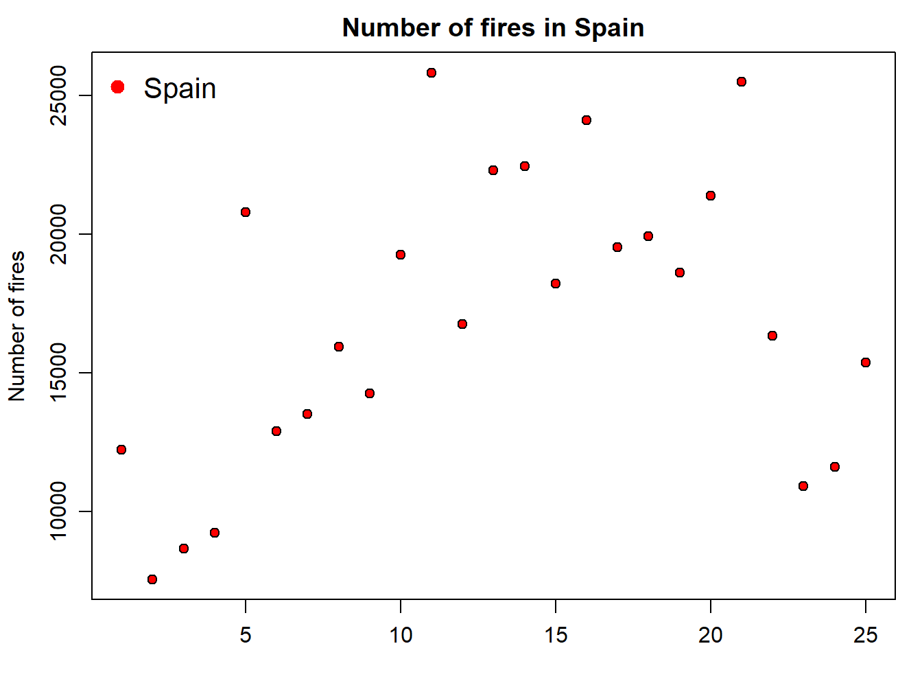
But, what if we want to add a second series of data? Then we proceed in a way similar to the legend() statement, but using the function points() similar to what we have seen in the plot() example. In the following code we add a second point data series with portugal:
par(mar=c(3.5, 3.5, 2, 1), mgp=c(2.4, 0.8, 0))
plot(fires$SPAIN,pch=21,cex=1,col='black',bg='red',
     main='Number of fires in Spain',ylab = 'Number of fires',xlab = '')
points(fires$PORTUGAL,pch=21,cex=1,col="blue",bg="blue")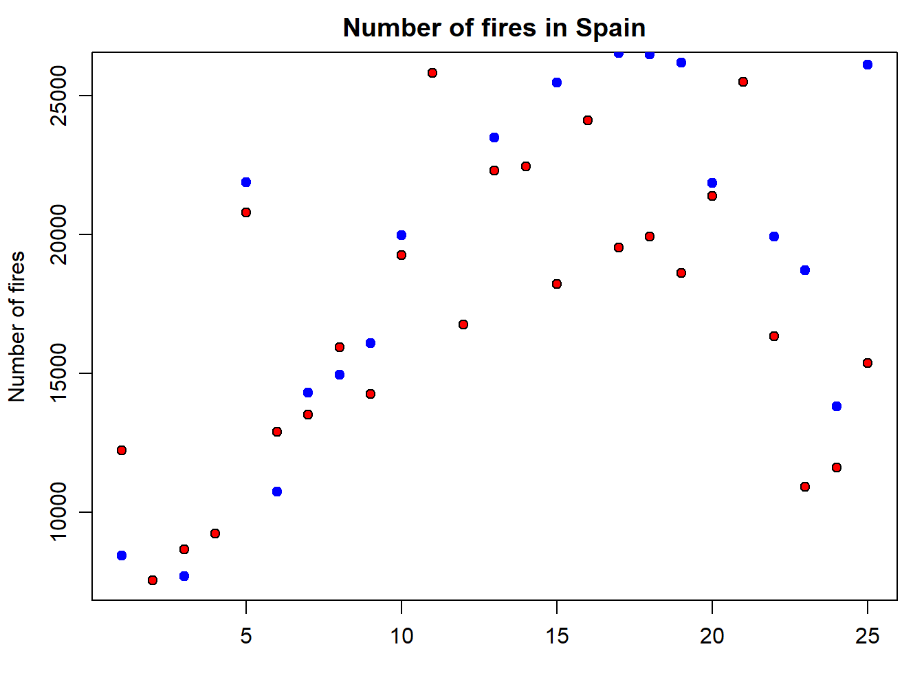
Finally, we update the legend to fit the new plot with the second series of data. To do that we simply include a second value on each argument using a vector:
par(mar=c(3.5, 3.5, 2, 1), mgp=c(2.4, 0.8, 0))
plot(fires$SPAIN,pch=21,cex=1,col='black',bg='red',
     main='Number of fires in Spain',ylab = 'Number of fires',xlab = '')
points(fires$PORTUGAL,pch=21,cex=1,col="blue",bg="blue")
legend( "topleft" , cex = 1.3, bty = "n", legend = c("Spain","Portugal"), , text.col = c("black"), col = c("red","blue") , pt.bg = c("red","blue") , pch = c(21) )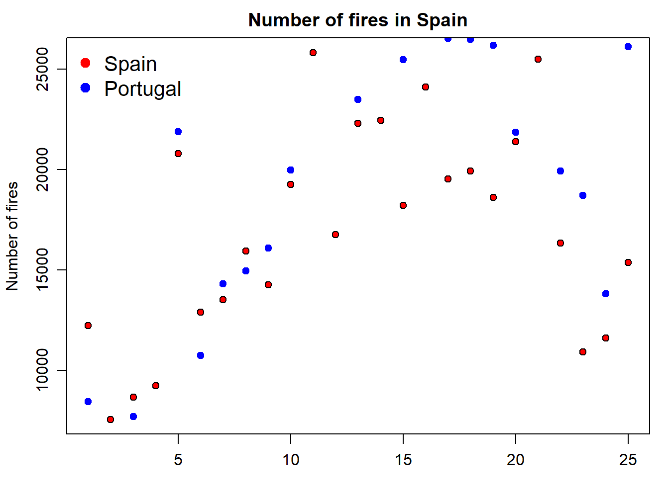
The problem we are now experiencing is that data for Portugal doesn’t fit in the extent of the plot as it is. We should modify this using the xlim and ylim arguments. At this point x-axis works fine, so we’ll leave it as it is. The problem comes from y-axis. We can solve it by passing the ylim argument passing the minimum and maximum values of the fires data. We bring here some functions from Descriptive statistics and summaries:
par(mar=c(3.5, 3.5, 2, 1), mgp=c(2.4, 0.8, 0))
plot(fires$SPAIN,pch=21,cex=1,col='black',bg='red',
     main='Number of fires in Spain',ylab = 'Number of fires',xlab = '',
     ylim = c(min(fires[,2:6]),max(fires[,2:6])))

points(fires$PORTUGAL,pch=21,cex=1,col="blue",bg="blue")
legend( "topleft" , cex = 1.3, bty = "n", legend = c("Spain","Portugal"), , text.col = c("black"), col = c("red","blue") , pt.bg = c("red","blue") , pch = c(21) )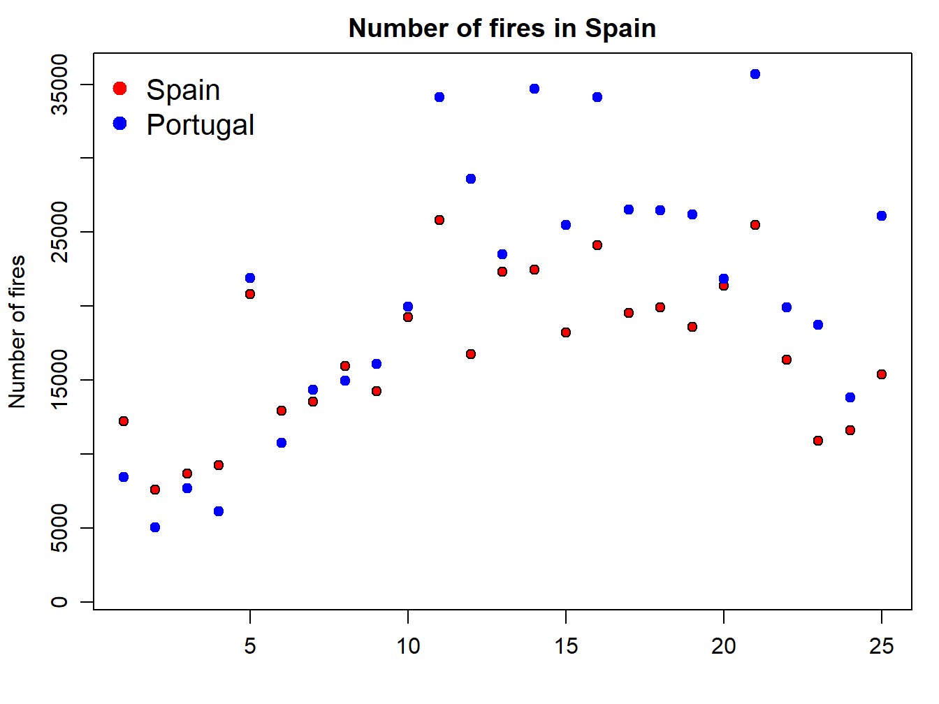
EXERCISE 3:
Explain in detail how the statement ylim = c(min(fires[,2:6]),max(fires[,2:6])) works in terms of the max() and min() functions and its interaction with the firesobject.
Deliverables:
- Write a brief report describing the working procedure of the aforementioned instruction.
4.1.2 Line plots
Well, this is quite easy. In line plots we use lines to represent our data series instead of points which are the default symbol. How do we do that? Just adding an additionla argument to specify we want to use lines with type = 'l':
par(mar=c(3.5, 3.5, 2, 1), mgp=c(2.4, 0.8, 0))
plot(fires$SPAIN,pch=4,type='l',col='red')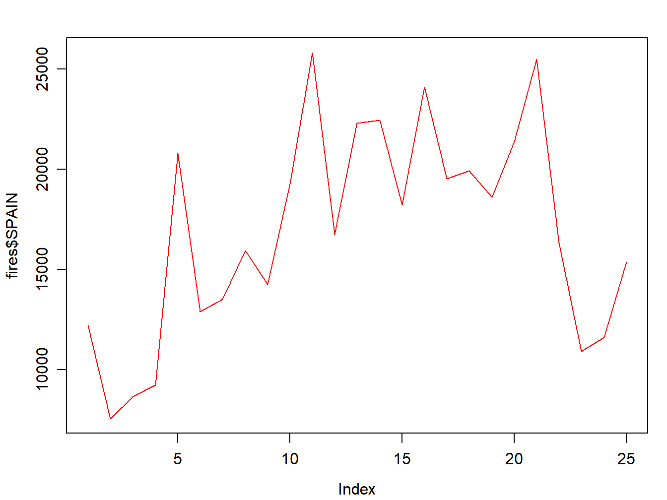
Of course we can change the line style:
par(mar=c(3.5, 3.5, 2, 1), mgp=c(2.4, 0.8, 0))
plot(fires$SPAIN,pch=4,type='l', lty=2, col='red')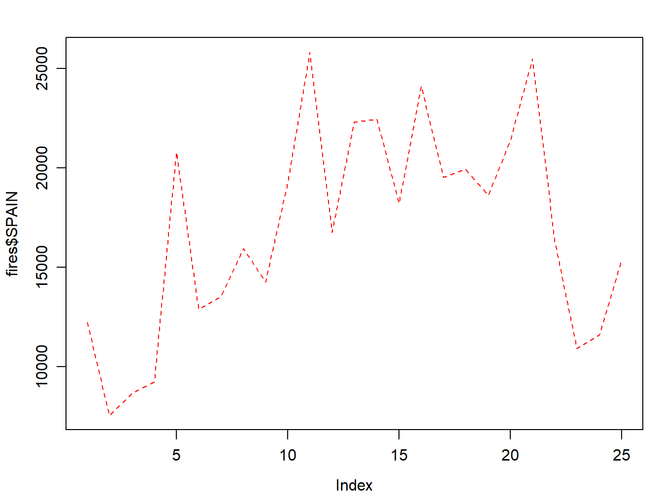
Adding a second (or third, fourth,…,\(n\)) series is done with lines():
par(mar=c(3.5, 3.5, 2, 1), mgp=c(2.4, 0.8, 0))
plot(fires$SPAIN,pch=4,type='l', col='red',
     ylim = c(min(fires[,2:6]),max(fires[,2:6])))
lines(fires$PORTUGAL,cex=1,col="blue",lty=2)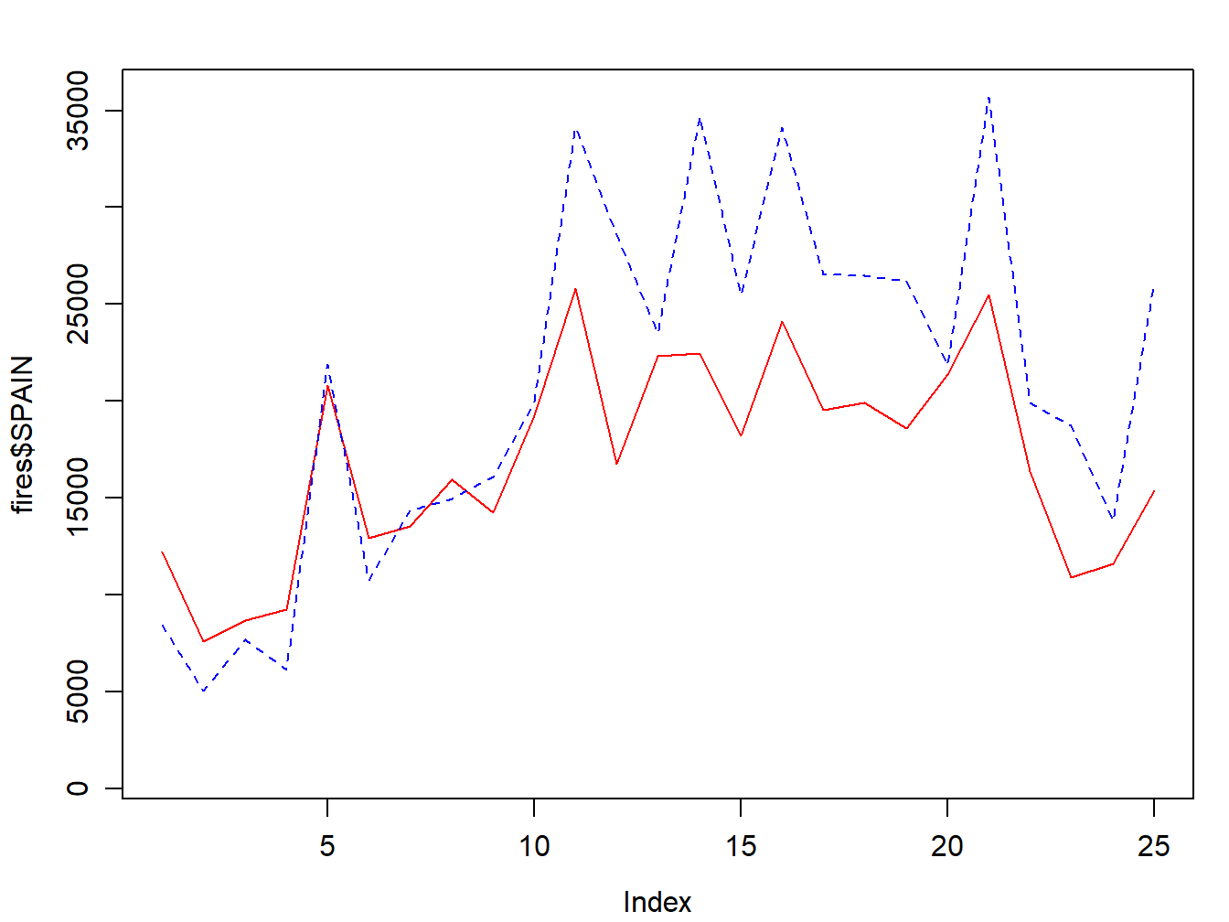
We now adapt the legend and add some titles and we are good to go:
par(mar=c(3.5, 3.5, 2, 1), mgp=c(2.4, 0.8, 0))
plot(fires$SPAIN,pch=4,type='l', col='red',
     main='Number of fires in Spain',ylab = 'Number of fires',xlab = '',
     ylim = c(min(fires[,2:6]),max(fires[,2:6])))
lines(fires$PORTUGAL,cex=1,col="blue",lty=2)

legend( "topleft" , cex = 1.3, , lty = c(1,2), legend = c("Spain","Portugal"), text.col = c("black"), col = c("red","blue"))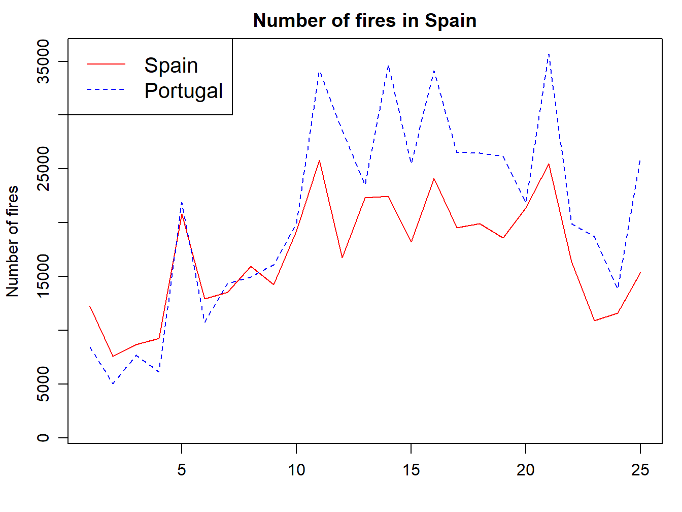
4.2 Histograms
The next type of chart we will see is the frequency histogram. It is a bar chart that represents the number of elements of a sample (frequency) that we find within a certain range of values.
To draw this type of plot R uses the function hist(), which requires as a mandatory argument a vector (or column/row of an array) with the data to be represented. As with all other chart types we have seen, we can use main, xlab… Let’s see at an example using the example data from the regression.txt file10(See Table 4.1):
Figure 4.1: Structure of the regression.txt file.
- Tavg_max: maximum average temperture in June.
- Tavg: average temperture in June.
- long: longitude in UTM values EPSG:23030.
- lot: latitude in UTM values EPSG:23030.
- d_atl: distance in meters to the Atlantic sea.
- d_medit: distance in meters to the Mediterranean sea.
- elevation: elevation above sea level in meters.
hist(regression$elevation)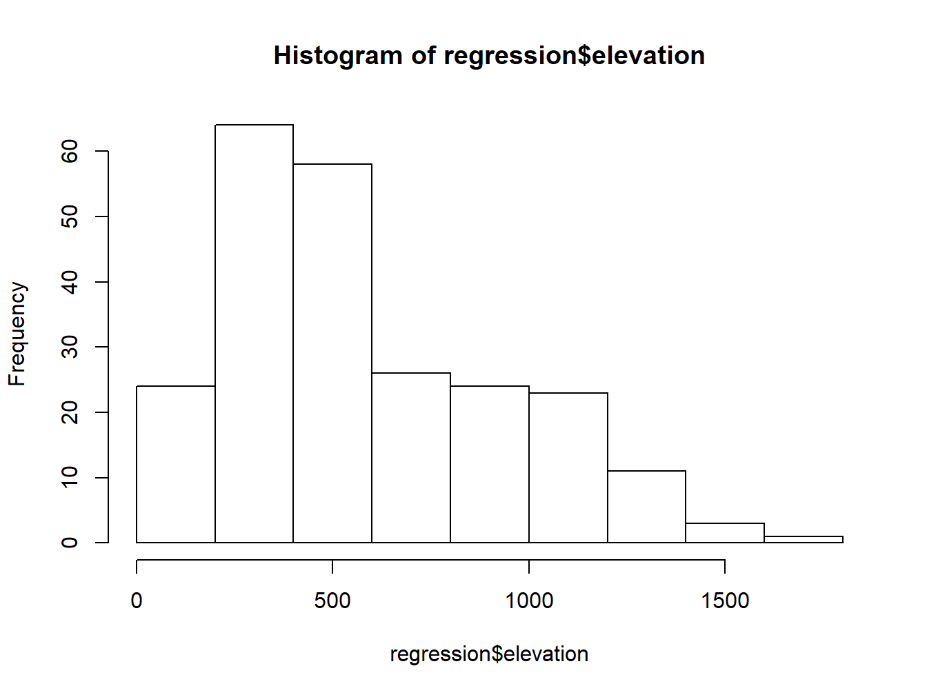
Then we use the arguments we have seen to customize the plot:
hist(regression$elevation,breaks=15,main="Elevation frecuency distribution",xlab="Elevation",ylab="Frecuency",col="blue",border="white",ylim=c(0,40),xlim=c(0,2000))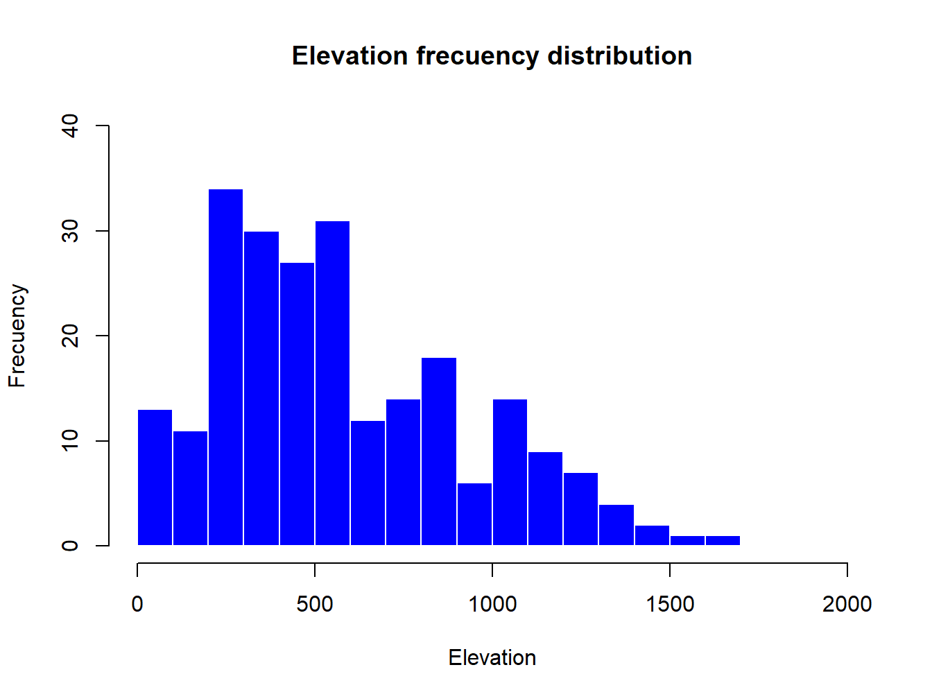
The only new parameters are:
breaks, used to specify the number of bars in thehistrogram.border, used the change the color of bar’s borders.
4.3 Scatterplots
So far we have seen how to construct univariate graphs, ie, represent a single variable or data series. Next we will see a type of bivariate graph, the scatterplot. This type of chart is interesting to visualize relations between two variables, almost mandatory to explore correlation or collinearity in regression analysis. Let’s look at an example with our fire data.
In this case we introduce in the function plot() a second data argument (\(y\)) with a second vector with the data right after the first data argument (\(x\)):
plot(regression$Tavg,regression$elevation)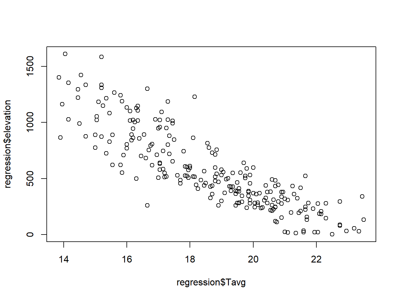
Note that the first data series goes to \(x-axis\) and the second to the \(y\). Again, we can customize the appearnce and symbols similar to the regural do plot:
plot(regression$elevation, regression$Tavg,
     main='Average temperature vs elevation',ylab = 'Temperature (Celsius)', xlab = 'Elevation (m)',
     pch=21, col='black', bg='steelblue')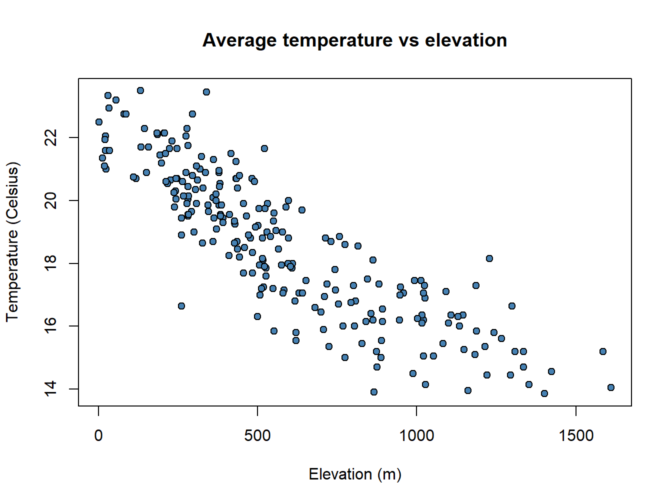
A particularly useful function in combination with scatterplots is abline() which allows to incorporate a trend line to the plot. We will further explore this later.
plot(regression$elevation, regression$Tavg,
     main='Average temperature vs elevation',ylab = 'Temperature (Celsius)', xlab = 'Elevation (m)',
     pch=21, col='black', bg='steelblue')
abline(lm(regression$Tavg~regression$elevation), lty=2, col='gray20',lwd=3)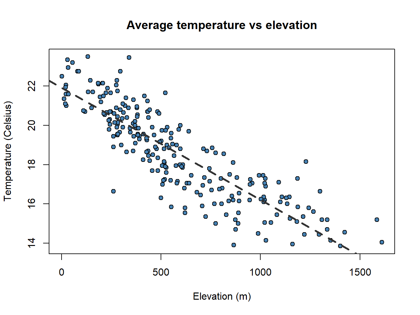
Pay attention to the order in which I have introduced the \(x\) and \(y\) data in plot() and abline(). It is the opposite!!.
4.4 Multiple plots
To finish with plot creation we will see two last possibilities. The first one is how to combine several charts in a single figure and the second how to export an image file from our graphics.
4.4.1 Create a combined plot
Combining several graphs in R is possible thanks to the function par(mfrow = c(rows, columns)). Using this function we prepare the display window to include several graphs simultaneously:
par(mfrow = c(2, 1),mar=c(3.5, 3.5, 2, 1), mgp=c(2.4, 0.8, 0))
plot(fires$SPAIN,pch=4,type='l', col='red',
     ylim = c(min(fires[,2:6]),max(fires[,2:6])))
plot(fires$PORTUGAL,type='l',col="blue",lty=2,
     ylim = c(min(fires[,2:6]),max(fires[,2:6])))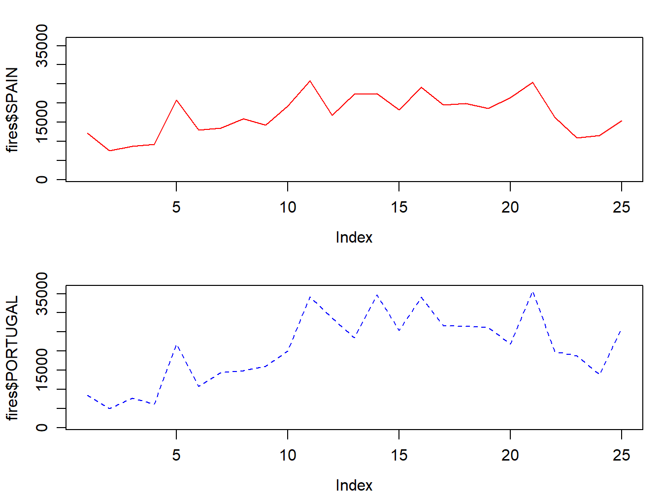
4.4.2 Export an image file
Since R runs on so many different operating systems, and supports so many different graphics formats, it’s not surprising that there are a variety of ways of saving your plots, depending on what operating system you are using, what you plan to do with the graph, and whether you’re connecting locally or remotely.
The first step in deciding how to save plots is to decide on the output format that you want to use. The following table lists some of the available formats, along with guidance as to when they may be useful.
Here’s a general method11 that will work on any computer with R, regardless of operating system or the way that you are connecting.
Choose the format that you want to use. In this example, I’ll save a plot as a JPG file, so I’ll use the jpeg driver.
The only argument that the device drivers need is the name of the file that you will use to save your graph. Remember that your plot will be stored relative to the current directory. You can find the current directory by typing
getwd()at the R prompt. You may want to make adjustments to the size of the plot before saving it. Consult the help file for your selected driver to learn how.Now enter your plotting commands as you normally would. You will not actually see the plot - the commands are being saved to a file instead.
When you’re done with your plotting commands, enter the
dev.off()command. This is very important - without it you’ll get a partial plot or nothing at all. So if I wanted to save a jpg file called “rplot.jpg” containing a plot of x and y, I would type the following commands:
jpeg('rplot.jpg', width = 800, height = 600, res=100)

# Here goes the plot
par(mfrow = c(2,1),mar=c(3.5, 3.5, 2, 1), mgp=c(2.4, 0.8, 0))
plot(fires$SPAIN,pch=4,type='l', col='red',
     ylim = c(min(fires[,2:6]),max(fires[,2:6])))
plot(fires$PORTUGAL,type='l',col="blue",lty=2,
     ylim = c(min(fires[,2:6]),max(fires[,2:6])))

dev.off()
## png
## 2please, ignore the
par()statement at this time↩Remember to import the file properly, setting the adequate parameters for field and decimal separator.↩
Taken from https://www.stat.berkeley.edu/classes/s133/saving.html↩